UX Best Practices to Keep Users on Your Site That Improve Retention
If your website isn’t keeping users engaged, you’re losing money. It’s that simple. Studies show that 55% of visitors leave a website within 15 seconds. That’s not a traffic problem. That’s a user experience problem. Every business in the USA — from solo entrepreneurs to Fortune 500 companies — needs to understand one truth: great UX keeps people staying, clicking, and buying.
This guide covers every UX best practice to keep users on your site. You’ll learn what works, what doesn’t, and exactly how to fix it.
What Is UX and Why It Matters for User Retention
User Experience (UX) is how a person feels when they use your website. It covers everything — speed, layout, content, navigation, and UX designer. Think of it like walking into a store. If it’s messy, slow, and confusing, you walk out. The same happens online, only faster. Poor digital user experience sends visitors straight to your competitors.
User retention strategies start with understanding your users deeply. According to Forrester Research, every $1 invested in UX returns $100 in value. That’s a 9,900% ROI. Businesses that improve user retention through UX see lower bounce rates, higher conversions, and stronger brand loyalty. UX isn’t just design. It’s your most powerful business tool.
“Design is not just what it looks like and feels like. Design is how it works.” — Steve Jobs
| UX Factor | Impact on Retention |
|---|---|
| Page Load Speed | 1-second delay = 7% drop in conversions |
| Mobile Responsiveness | 61% of users won’t return after mobile issues |
| Clear Navigation | Reduces bounce rate by up to 50% |
| Readable Content | Increases time-on-site by 40% |
| Accessibility | Reaches 26% more U.S. users with disabilities |
The Business Cost of Ignoring UX in the USA
Bad UX costs U.S. businesses $1.4 billion every single year in lost productivity alone. Cart abandonment rates sit at nearly 70%, and most of that happens because of poor website usability. When users hit friction points — slow pages, broken buttons, confusing layouts — they leave without converting. Amazon reported that simplifying its checkout process added $300 million in revenue annually. That’s the power of removing just one layer of friction. User behavior data consistently shows that frustrated users don’t come back. Fix the experience first and the revenue follows naturally.
Make a Strong First Impression with Smart UX Design
You have exactly 0.05 seconds to impress a visitor. Research from Google confirms this. Users judge your entire brand credibility within a fraction of a second. That first moment shapes everything. Visual hierarchy is what guides the eye. It tells users where to look, what matters most, and what to do next. Without it, your page feels like visual noise.
Intuitive UX design starts above the fold. That’s the section users see before they scroll. Your headline, value proposition, and call-to-action must all live there. Use strong contrast, clean fonts, and purposeful whitespace. Think of Apple’s homepage — minimal, bold, and instantly clear. That’s intentional web interface design at its finest. Your first impression either earns trust or destroys it.
What Users Notice First (Eye-Tracking Research)
According to Nielsen Norman Group eye-tracking studies, users follow an F-pattern when reading web pages. They scan the top, then move left to right in shorter sweeps as they go down. This means your most important content must sit in the top-left zone. Cognitive load increases when pages feel cluttered. Reduce it by using whitespace generously. Place your primary call-to-action button in a high-contrast color above the fold. Use hover states to signal interactivity. Every visual decision either helps or hinders the user’s first experience.
Simplify Website Navigation to Keep Users Engaged
Confusing navigation is the number one reason users abandon websites. If someone can’t find what they need in three clicks, they’re gone. Navigation design should feel effortless — like the website is reading your mind. Clear navigation menus reduce cognitive friction and guide users naturally through your content. Think of navigation as a roadmap. Without clear signs, your visitor gets lost and eventually gives up.
Easy website navigation isn’t just about aesthetics. It directly impacts your conversion rate optimization. Sticky headers keep your menu visible as users scroll. Breadcrumbs show users exactly where they are on your site. A powerful search functionality bar handles what menus can’t. According to Baymard Institute, 70% of e-commerce sites have inadequate navigation menus — meaning most businesses are already failing here. Don’t be one of them.
| Navigation Element | Best Practice |
|---|---|
| Menu Labels | Use plain language users understand |
| Number of Menu Items | Keep it between 5 and 7 items |
| Search Bar | Place it prominently in the header |
| Mobile Menu | Use a clear hamburger or tab bar |
| Breadcrumbs | Always show location context |
| Footer Navigation | Include secondary links for deep pages |
How to Structure Menus That Users Actually Use
Navigation menus should reflect how users think, not how your company is organized internally. This is a mistake nearly every business makes. Run card-sorting tests with real users. Ask them to group your content in ways that feel natural to them. Then build your menu around their logic, not yours. User journey mapping reveals exactly where users expect to find specific information. When menus match mental models, users stay longer and explore deeper. Add interaction feedback — subtle highlights or animations — so users always know which page they’re on.
Improve Page Speed and Performance for Better UX
Speed is UX. There’s no separating the two. Google’s Core Web Vitals — Largest Contentful Paint (LCP), First Input Delay (FID), and Cumulative Layout Shift (CLS) — are now official ranking factors. A fast loading website isn’t just about user happiness. It directly affects your search visibility. According to Portent, a site that loads in 1 second has a 3x higher conversion rate than one that loads in 5 seconds. Website performance optimization is non-negotiable for any competitive U.S. business.
Mobile speed optimization deserves special attention. Over 63% of U.S. web traffic comes from mobile devices. Yet most businesses optimize only for desktop. Use Google PageSpeed Insights to identify your slowest elements. Compress images into WebP format. Enable lazy loading so images only load when users scroll to them. Use a CDN (Content Delivery Network) to serve content from servers closest to your user. These aren’t technical luxuries — they’re baseline requirements for frictionless user experience.
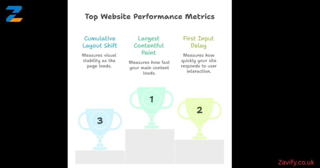
Core Web Vitals — What They Mean
Largest Contentful Paint (LCP) measures how fast your main content loads. Aim for under 2.5 seconds. First Input Delay (FID) measures how quickly your site responds to the first user interaction. Keep it under 100 milliseconds. Cumulative Layout Shift (CLS) measures visual stability — elements jumping around as the page loads. Keep CLS below 0.1. All three directly impact both user satisfaction improvement and Google rankings simultaneously.
Use Consistent Design to Build Trust and Credibility
Design consistency builds subconscious trust. When every page feels like part of the same family — same fonts, same colors, same button styles — users feel safe. Inconsistency, on the other hand, triggers doubt. Users wonder if they’ve accidentally left your site. That hesitation kills user engagement techniques and sends people bouncing away. Layout consistency isn’t just good design practice. It’s a psychological trust signal that works quietly in the background.
UI UX improvements often start with building a proper design system. Giants like Google (Material Design) and Apple (Human Interface Guidelines) publish their design systems publicly. Your business doesn’t need that level of complexity. But you do need documented rules for colors, typography, spacing, and components. This ensures interaction design stays coherent whether a user lands on your homepage, blog, or product page. Consistent design also speeds up development — a double win for growing businesses.
“Consistency is one of the most powerful usability principles: when things always behave the same, users don’t have to worry about what will happen.” — Nielsen Norman Group
Design for Mobile Users and Multiple Devices
Mobile responsiveness isn’t optional anymore. Google switched to mobile-first indexing in 2021. That means Google primarily uses your mobile site for ranking and indexing. If your mobile experience is broken, your entire SEO strategy suffers. Responsive website design adapts fluidly to any screen size — from a 4-inch smartphone to a 27-inch desktop monitor. Responsive layouts keep your content readable, your buttons tappable, and your forms fillable across every device.
Mobile UX optimization requires thinking with your thumbs. Literally. Most users hold phones with one hand and navigate with their thumb. The bottom third of the screen is the easiest area to reach. Place your most important call-to-action buttons there. Keep touch targets at least 44×44 pixels — Apple’s recommended minimum. Avoid pop-ups that cover the full mobile screen. Google penalizes these directly. A seamless mobile user experience means less friction, more time on site, and higher conversion rates across every device.
| Mobile UX Issue | Fix |
|---|---|
| Small touch targets | Minimum 44x44px tap areas |
| Full-screen pop-ups | Use banners or slide-ins instead |
| Uncompressed images | Use WebP and responsive image tags |
| Horizontal scrolling | Use fluid grids and flexible layouts |
| Tiny font sizes | Minimum 16px body text on mobile |
| Slow mobile load | Enable AMP or optimize critical rendering |
Make Content Easy to Read and Understand
Website readability optimization directly impacts how long users stay on your page. The average U.S. adult reads at an 8th-grade level. That’s not an insult — it’s neuroscience. The brain prefers simplicity when scanning digital content. Use short sentences. Break content into clear sections. Use font readability best practices — sans-serif fonts like Inter, Roboto, or Open Sans work best on screens. Keep body text at a minimum of 16px. Use generous line spacing of at least 1.5x your font size.
UX writing — the craft of writing for digital interfaces — shapes how users move through your site. Every label, button, error message, and tooltip is a UX writing opportunity. Microcopy (tiny bits of copy like “Don’t worry, we hate spam too” under an email field) reduces anxiety and builds trust. Progress indicators help users know how far they are in a process. These small touches dramatically improve user experience design and reduce drop-off rates during multi-step flows like checkouts or sign-ups.
Writing for the Web vs. Writing for Print
Web writing follows the inverted pyramid model. You put the most important information first, then expand on it below. Print writing builds to a conclusion. Web users don’t read — they scan. Use descriptive subheadings so scanners instantly know what each section covers. Use color contrast that meets WCAG AA standards (minimum 4.5:1 ratio for body text). Highlight key terms with bold text. Break walls of text with images, callout boxes, or data tables. This approach to website layout optimization keeps readers engaged far longer than traditional prose blocks.
Build Trust Through Accessibility and Inclusive UX
Accessibility features aren’t a bonus. They’re a legal requirement and a moral obligation. The Americans with Disabilities Act (ADA) applies to websites. In 2023 alone, over 4,600 ADA-related web accessibility lawsuits were filed in the USA. WCAG 2.1 AA compliance protects your business legally while also expanding your audience. Screen reader support, proper alt text, keyboard navigation, and color contrast ratios are the baseline. Accessible design is better design — for everyone.
Inclusive design means building for the full spectrum of human ability. This includes users with visual, auditory, motor, and cognitive differences. Use ARIA labels on interactive elements. Provide captions for all videos. Ensure your site is fully navigable via keyboard alone. Use tools like WebAIM’s Contrast Checker and axe DevTools to audit your site regularly. Mobile accessibility matters equally — screen readers on iOS and Android are widely used. When you build inclusively, you inherently create a user-friendly website design that converts better for everyone.
“Accessibility is not a feature, it’s a social trend.” — Antonio Santos
Personalize User Experience to Increase Engagement
Personalization features have moved from luxury to expectation. According to Epsilon, 80% of consumers are more likely to buy from a brand that offers personalized experiences. Behavioral triggers — actions users take on your site — can dynamically change what content they see next. Show returning visitors different homepage content than first-timers. Display recently viewed products. Recommend articles based on reading history. This level of custom website design thinking creates a feeling that your site truly understands the user.
Habit-forming design uses psychology to build loyalty. Reward systems, like loyalty points or progress badges, tap into decision-making behavior patterns identified by behavioral economist BJ Fogg. Gamification elements — streaks, achievements, leaderboards — increase daily active users dramatically. Duolingo grew to 500 million users largely through gamified UX. You don’t need Duolingo’s budget to apply these principles. Even a simple progress bar during onboarding can boost completion rates by 20% or more.
| Personalization Tool | Best For | Cost Level |
|---|---|---|
| HubSpot CMS | Dynamic content by lifecycle stage | Medium |
| Optimizely | A/B testing and personalization | High |
| Microsoft Clarity | Behavior analytics (free) | Free |
| Hotjar | Heatmaps and session recordings | Low–Medium |
| Google Optimize (via GA4) | Basic personalization experiments | Free |
Collect Feedback and Continuously Improve UX
User feedback is the compass that keeps your UX pointed in the right direction. Without it, you’re designing in the dark. Usability testing — watching real users attempt real tasks on your site — reveals problems no designer would ever notice alone. Run moderated tests for deep qualitative insight. Use unmoderated platforms like UserTesting.com for faster, broader results. Even five users in a usability test reveals 85% of your site’s major problems, according to Jakob Nielsen’s landmark research.
UX testing tools like Hotjar and Microsoft Clarity show you heatmaps, scroll depth, and rage clicks (where frustrated users click repeatedly on non-clickable elements). These user engagement signals paint a vivid picture of confusion and friction. Set up exit-intent surveys to catch users as they’re about to leave. Ask one simple question: “What stopped you from completing your goal today?” The answers will transform your UI UX improvements pipeline. UX is never finished — it only gets better with consistent iteration.
Setting Up a Simple UX Feedback System for Your Business
Start with Microsoft Clarity — it’s completely free and takes 10 minutes to install. It shows session recordings and heatmaps immediately. Next, add a one-question NPS survey using Hotjar or Typeform at your checkout confirmation page. Then schedule a monthly UX review where you watch 10 session recordings as a team. Look for patterns — where do users hesitate? Where do they rage-click? What pages have the highest exit rates? Build a simple spreadsheet tracking these friction points monthly. Over time, this habit of continuous UX testing becomes your strongest competitive advantage in the market.
Common UX Mistakes That Drive Users Away
The most damaging UX mistakes are often the most common ones. Auto-playing videos with sound instantly annoy users and trigger immediate page abandonment. Aggressive user onboarding pop-ups that appear before users have read a single word destroy first impressions. Broken links and 404 errors signal neglect and erode trust rapidly. Cluttered homepages that try to communicate everything at once communicate nothing effectively. Each of these mistakes directly damages your website user retention numbers in measurable, trackable ways.
Interaction feedback failures are equally destructive. When users click a button and nothing visibly happens, they panic. They click again. And again. Microinteractions — subtle animations that confirm actions — prevent this anxiety. A button that changes color when clicked. A loading spinner that appears after form submission. A checkmark that confirms a successful save. These tiny interaction design moments build enormous user confidence. Ignoring them creates friction points that silently kill your task completion flow and tank your conversion rates without you even realizing it.
Future Trends in UX That Will Shape User Retention
The future of UX design strategies is being written right now. AI-powered personalization is moving from recommendation engines to fully predictive interfaces — sites that anticipate your next action before you take it. Voice UI is growing rapidly, with over 150 million Americans using voice assistants regularly. Interaction design is evolving beyond screens. Designers must now think about how experiences feel across smart speakers, AR glasses, and wearable devices. Website interaction design in 2025 and beyond will be multimodal, adaptive, and deeply personal.
Microinteractions, motion design, and progress bars are becoming standard expectations rather than delightful surprises. Users increasingly expect instant interaction feedback from every element they touch. Privacy-first UX is also rising sharply as third-party cookies phase out completely. Brands that build trust through transparent data practices and cookie-free personalization will win the loyalty game. User journey optimization will increasingly rely on first-party data — email behavior, on-site actions, and purchase history — to deliver experiences that feel genuinely helpful rather than intrusive or creepy.
How to Future-Proof Your Website’s UX Strategy
Build your UX on a modular, component-based foundation today. This makes future updates faster and cheaper. Invest in a proper design system — even a simple Figma component library makes a massive difference at scale. Follow industry leaders like Nielsen Norman Group (nngroup.com) and Smashing Magazine (smashingmagazine.com) for research-backed UX insights. Treat accessibility features as a baseline — not an afterthought — because accessibility standards are only getting stricter. Embrace onboarding tools and tooltips that educate users naturally during their first session. The businesses that treat UX as an ongoing investment — not a one-time project — will dominate user engagement techniques in every competitive market.
Final Thoughts on UX Best Practices to Keep Users on Your Site
Great UX isn’t magic. It’s empathy made digital. Every principle in this guide comes back to one idea — understand your users deeply and remove every obstacle standing between them and their goal. When you apply these UX best practices to keep users on your site, you’re not just improving design. You’re building a business that people actually enjoy using. And in today’s crowded digital landscape, that enjoyment is your most powerful competitive advantage.
Start small if you need to. Fix your page speed this week. Audit your navigation next week. Run your first usability test next month. Every single improvement compounds over time. Improve user retention by one metric at a time and watch the results multiply. Your users are telling you exactly what they need through their behavior — through user engagement signals, rage clicks, exit pages, and abandoned forms. Listen to them. Respond with better design. The businesses that commit to seamless user experience as a core value don’t just keep users on their site — they turn those users into loyal, lifelong customers.