
I come across interesting data all the time. A stat in a report, an unexpected finding from a survey or even something from an old blog post that feels relevant again.
Then, the problem would be figuring out what to do with it because no one has the time for a wall of text anymore these days.
Turning one stat into an infographic sounds simple enough, until I have to think about which data to include, what chart to use and how to make it interesting enough to catch someone’s eye.
And since I’m not a designer, that’s usually the point where a simple content repurposing idea starts feeling like a much bigger project.
Lately, I’ve been using AI to make that part easier. Not to create more content for the sake of it, but to get more out of the content and data I already have and here’s how.
Most of your best content is probably already published
Content repurposing used to be turning a 50 page white paper or report into a blog post into a LinkedIn post, or pulling a few quotes from an article, and maybe even turning what you have into a carousel.
But data-rich content gives you much more to work with. A single report can have plenty of smaller stories hidden in the numbers, from unexpected findings to year-over-year changes.
Normally, finding those angles means going back through the whole thing again. But now, instead of that, I use AI to find stories worth visualizing.
I use AI to find the stories worth visualizing
Let’s say I have a 30-page report.
Instead of rereading every page, I’ll give it to an AI tool and ask something like:
“Find five findings in this report that could work as standalone visual content. Look for surprising statistics, comparisons and trends rather than simply summarizing the report.”
That gives me somewhere to start.
I’m not asking AI to tell me what the report says, I already know the report inside out. I want it to help me find the bits that could become something else.
Because a statistic on its own isn’t always much of a story.
“68% of small businesses use AI” is useful.
But if that number was 34% two years ago, suddenly I have a much more interesting and relatable angle: AI adoption has doubled for SMEs.
On to the hard part: figuring out what I want it to look like
This is where being a non-designer catches up with me.
I might know that I have a good story, but I don’t always know whether it needs a chart, infographic, timeline or something completely different.
AI helps here too. I’ll ask for a few ways the data could be visualized and then pick the one that makes it easiest to understand.
Using AI to get the information together
My first step is usually getting AI to scan the report because, honestly, I don’t want to read through 30 pages again just to find a few stats worth repurposing.
I’ll ask it to pull out interesting data, trends or comparisons, then go back to the original report to check the ones that catch my attention.
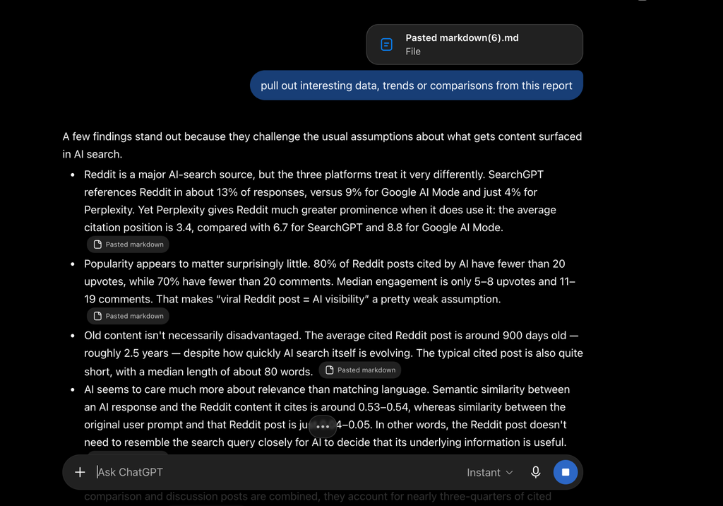
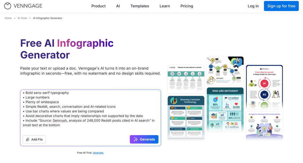
Once I’ve picked an angle, I’ll get AI to organize the information and write a design prompt for me. This is especially helpful because I usually know what I want to say, but not necessarily how I want it to look.
Then I take that prompt into Venngage AI.
That’s how I tend to split the work: AI helps me get the information together and shape the story, while Venngage AI 100+ design generators become my design assistant and turns it into something visual.
Then I work on getting the visual right
The first draft is really just the starting point. Once I have something to work with, I can focus on whether the visual actually tells the story I had in mind.
With Venngage’s AI Designer, I can ask for changes in plain language instead of figuring out how to make them myself. I can shorten sections, change the layout, adjust the visuals or keep refining things until the main takeaway is clear.
If I’m working with data, I can also import CSV or Excel files to create editable charts instead of rebuilding them manually. And once everything looks right, I can apply our Brand Kit to bring in the right fonts, colors and logo.
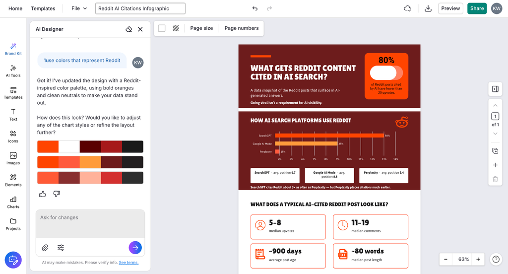
That’s the part I find most useful as a non-designer. I’m still deciding what stays, what goes and what the visual needs to communicate. I just don’t have to know how to design every part of it myself.
One report can turn into a lot of content
This is probably my favorite part of the whole workflow.
If I pull five good findings from a report and turn them into an infographic, I already have the starting point for a few more pieces of content.
The strongest chart could become a LinkedIn post. A few related findings could become a carousel. One interesting stat could work as a social graphic or find its way into a newsletter.
I’ve also been playing around with Venngage’s new AI Infographic Charts for this. You can give it a topic and it’ll build a chart around it, including finding the data for you if you don’t already have it. Or, if I’m repurposing a report, I can add my own data instead.
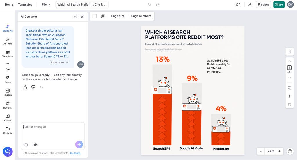
The chart opens in the editor, so I can tweak the text, background, layout and chart itself before using it somewhere else. It’s an easy way to turn one finding into its own visual without having to build another asset from scratch.
Before I know it, a report we published months ago is useful again.
And that’s really the point of repurposing content for me. Not creating more content just to fill the calendar, but getting more out of research we’ve already spent time and resources creating.
But AI doesn’t get the final say
That said, as much as I use AI throughout this process, I still go back and check the original source.
If it pulls out a statistic, I make sure the number and context are right. If it spots a trend, I check that the data actually supports it. And when I turn that data into a visual, I make sure the chart isn’t over exaggerating the data with misleading titles.
Your next content idea might already exist
This whole process has changed how I look at older content.
There’s probably a good stat, comparison or story sitting in a report, survey or blog post that we published months ago and haven’t thought about since.
Now it’s much easier to go back, find those overlooked bits and actually do something with them. AI helps with the digging, and tools like Venngage AI to make the design side of things much less scary for non-designers like me.
For me, that’s what makes this kind of repurposing useful. It’s less about rewriting the same content five different ways and more finding the stories we didn’t use the first time.